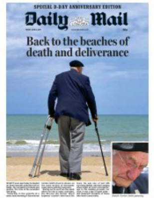
An old man looks out to sea. There's a stoop to his shoulders. His jacket misshapen from how many years of bits and bobs stuffed in the pocket. Somehow we know, even from the back, that he is in contemplative mood. Is he looking for his grandchildren? No, the clothes are too formal. The shoes aren't designed for a beach outing.
We know, of course, that Gordon Smith is in Normandy for the D-Day 70th anniversary commemorations. But the picture is full of possibilities - until we look at the inset picture showing the tearful face of a 90-year-old man remembering lost colleagues.
The headline, picture and restrained text show the Mail at its best.
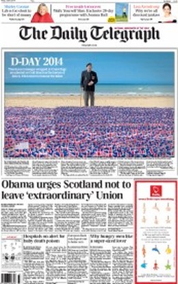
This morning every paper but the Star found a home for the D-Day veterans on the front page. The Mail struck exactly the right tone. The Telegraph, too, showed dignity. It decided not to afford itself the luxury of the entire front page, but it kept the puffs simple and gave its picture and text room to breathe.
We know, of course, that Gordon Smith is in Normandy for the D-Day 70th anniversary commemorations. But the picture is full of possibilities - until we look at the inset picture showing the tearful face of a 90-year-old man remembering lost colleagues.
The headline, picture and restrained text show the Mail at its best.
This morning every paper but the Star found a home for the D-Day veterans on the front page. The Mail struck exactly the right tone. The Telegraph, too, showed dignity. It decided not to afford itself the luxury of the entire front page, but it kept the puffs simple and gave its picture and text room to breathe.
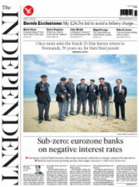
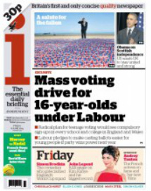
The Independent was similarly restrained, while the i curtailed the standard front page puffery and abandoned the big white on black splash in the centre to produce a front that was far cleaner and more appealing than usual.
 |  |
The first decision that had to be made was were you going to blow the entire front on the commemorations? Only the Mail answered that question with an unequivocal "Yes".
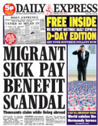
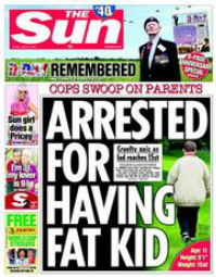
Only the Star ignored the occasion altogether, preferring a more conventional style of beachwear for its cover. The Sun and the Express both got in a right muddle as a direct result of the determination to incorporate the D-Day pictures in the usual puff-heavy Friday format. It was understandable with the Sun as it had a good exclusive that was followed up everywhere. There was no excuse for the Express. If you've read one migrants-rip-us-off splash, you've pretty well read them all. The pages are a mess and need tearing up and starting again.
Only the Star ignored the occasion altogether, preferring a more conventional style of beachwear for its cover. The Sun and the Express both got in a right muddle as a direct result of the determination to incorporate the D-Day pictures in the usual puff-heavy Friday format. It was understandable with the Sun as it had a good exclusive that was followed up everywhere. There was no excuse for the Express. If you've read one migrants-rip-us-off splash, you've pretty well read them all. The pages are a mess and need tearing up and starting again.
 |  |
Far more interesting, from SubScribe's point of view, are the Times, Guardian and Mirror. The Times reined back on its habitual exuberant Friday puff. There was no Caitlin Moran looking kooky through a pair of binoculars; the Bricks & Mortar promo is restrained. The Guardian stuck with its usual Friday fare, while the Mirror tried to cram too much onto the page by including a Farage story that didn't require a page one presence. Had he admitted any naughtiness with the woman who was the subject of yesterday's splash it would have been another matter. But he didn't. A righteous denial was what would have been expected and that was what we got. One to bury.
As former colleagues know to their exasperation and despair, SubScribe was a great one for tinkering with pages after they'd gone to press. And so today I've had a bit of fun cutting and pasting these three fronts . You may well think the originals are best...or maybe not...
As former colleagues know to their exasperation and despair, SubScribe was a great one for tinkering with pages after they'd gone to press. And so today I've had a bit of fun cutting and pasting these three fronts . You may well think the originals are best...or maybe not...
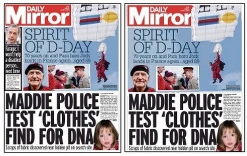
If we get rid of Mr Farage we have far more room to display the rather wonderful story of 89-year-old Jack Hutton parachuting into Normandy (albeit on a piggyback parachute) 70 years after he made the drop in the midst of war. If we move the modern pictures to the left and put a little space between them, the whole element becomes less crowded and there is room to get the feel of Mr Hutton in the great open skies. Or maybe we think that Farage was essential?
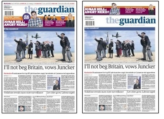
The Guardian chose to keep its multi-element puff in the usual position, so it ended up with five cutout figures immediately above a photograph of a collection of figures standing on the beach saluting a flypast of wartime aircraft. It's a pretty uninspiring picture, to be honest - especially given what else was around - but it is destroyed by that huge Jonah Hill in the puff.
How would it be if we got rid of the Klaxons pictures, and made Jonah and Gwynnie smaller? If we also lose the blue bubbles it all becomes calmer. Finally, if we put the whole shebang on top of the titlepiece, there is nothing to interfere with the main picture. Or maybe we think it's right that the veterans salute Jonah Hill?
How would it be if we got rid of the Klaxons pictures, and made Jonah and Gwynnie smaller? If we also lose the blue bubbles it all becomes calmer. Finally, if we put the whole shebang on top of the titlepiece, there is nothing to interfere with the main picture. Or maybe we think it's right that the veterans salute Jonah Hill?
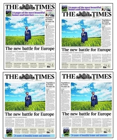
The Times's Bricks & Mortar blurb is modest by usual Friday standards, but is that interior picture on the right part of the puff or part of the column five story? If we move the whole caboodle above the titlepiece it becomes clearer and the bottom of the puff doesn't meld into the main picture.
But why stop there? The Times is a tabloid (sorry, compact), the whole paper goes on display at the newsagent's, so who says the puff needs to be at the top? A curtailed version at the bottom gives the page more of an air of solemnity, telling the reader that this is something out of the ordinary, while still selling the property supplement. And if we wanted to balance the page, we could move the main picture across a column.
All of which proves three things:
1: there are many ways to skin a cat
2: that it's vital to think of what the rest of the front is saying when designing a puff
3: you are never too old for a session of cutting and sticking.
Happy weekend
 RSS Feed