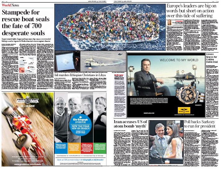
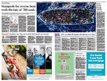
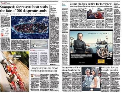
The Telegraph hasn't covered itself with glory in its reporting of the Mediterranean boat people tragedies. SubScribe has written about that as part of a general review here. This, however, is a blog about visuals and this spread warrants separate consideration from that perspective.
The first horror is that John Travolta watch ad.
In common with most papers, the Telegraph sells advertising on a different grid to that used by editorial. This is all very well with full-width flat ads or with the quarter pagers, as seen on the left-hand side of this spread.
These 25x4 ads equal 25x3s on the six-column editorial grid, so even if there were only one, it would be easily accommodated without changing the editorial column width.
The Breitling monstrosity is a six-column ad, which leaves two skinny columns for the journalists to play with. If it were set bottom right, as convention dictates, the remaining space could be used as one wider-than-usual column to accommodate briefs, a diary or picture story (inadvisable against such a dominant image).
But here we have another example of the advertiser managing to dominate the page without paying the space rate for the privilege. The positioning of the ad - it is deeper than the editorial space either above or below - disrupts the flow of the entire spread and makes engaging editorial design virtually impossible.
Peter Oborne alleged in his resignation blog that commercial interests ruled at the Telegraph, but the placing of this ad on page 13 suggests that someone at the paper might have put up a fight. Designer watch ads tend to be on very early right-handers. This is way back for Breitling, so maybe it was exiled to foreign as a punishment for its ugliness.
Then there are the journalistic howlers. How did anyone think it a good idea to have a standalone picture of the Clooneys larking about on the same page as the drowning of 700 people? It's a charming enough photograph, but it has no news value and is certainly not necessary as a text breaker, what with the ferry pictures and Travolta and all. There would have been no shame in having three double-column text-only stories in a row at the foot of the page. (Incidentally, why is the Sarkozy story set ragged right? There is no typographical or editorial reason for it, as there might be were it a piece of commentary or analysis.)
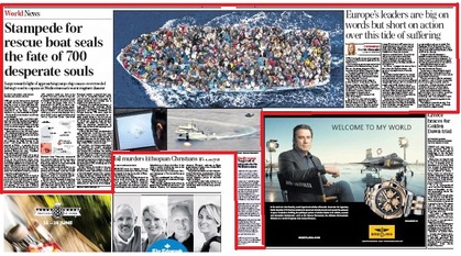
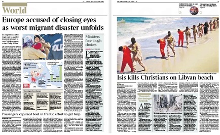
On to the main story of the Mediterranean drownings. My scruffy red line above shows how this meanders across the spread with an unrelated story about an Isil massacre stuck in the middle under the picture complex. Maybe in the Telegraph's eyes, the stories are related since they both emanate from Libya, but even in that case, the beach massacre should be alongside (see the Times's more elegant treatment below) rather than incorporated in the drownings package.
| [To think that I used to look enviously at the acres of space the Telegraph had to play with, compared with our squeezed Times pages!] |
Back to the Telegraph.
Another problem with the spread is the choice of photographs. With no live "at sea" pictures available, the main image is a Massimo Sestini picture of refugees packed into an Italian rescue boat off the African coast on June 8 last year - when the Mare Nostrum force was still operating. This is wrongly described in as "Migrants on a vessel attempting to cross the Mediterranean last year." The banality of the remainder of the caption - "an officer studies a monitor showing the search operation; and a rescue ship and helicopter" - is a demonstration not only of unimaginative subbing but of the lack of value of the two subsidiary pictures. Neither picture adds anything to the package and both should have been dumped.
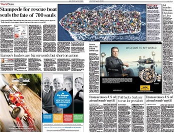
Below is one interpretation of how the spread might have worked better by dropping the three pictures. There is more room for Isil and space for an extra story at the bottom - which could be used for Greece if there were another text element for the boat people. There are obviously many permutations, and even more if a different main picture were chosen. But the main objective here is to get the story and commentary closer together.
Ideally, though, there should have been some reconfiguration of the flatplan. If Breitling stipulated the first foreign righthander, then editorial's room to maneouvre is limited. Given the "welcome to my world" copyline, that may well have been the case. But if not, then it might have been better to swap it with ads from the final home page to give a more open spread for the Med.
Another solution would be to move or drop the Telegraph investor house ad on the lefthander and go for one clean hit there. The main story could run much longer if the copy were there, or Isil could run in column six, as per my example. That would leave plenty of room for other material on the Travolta page - and the Clooneys wouldn't seem so out of place. All it would need would be a decent hamper page lead (ideally Isil, but I've pasted in Zuma for illustrative purposes) and a column of nibs.
As ever, there is no right or wrong, but there is bad and better. And the key to that is working with the advertising department and thoughtful flat-planning. What was most important was to minimise the jarring effect of running a serious news story about the drowning of hundreds of people who had nothing alongside privileged Hollywood stars with everything.
And in that the Telegraph failed.
And in that the Telegraph failed.



 RSS Feed


