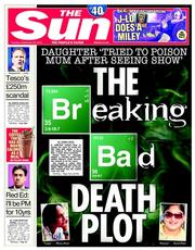
The Sun's front front today is an ugly typographical mishmash, thanks to a court case that finds its place on page one because of a Breaking Bad line.
It's not uninteresting, but without the Heisenberg anglem this alleged attempted murder would have got no further forward than page 11.
Having jumped on the concept, the designers were allowed (or instructed) to run amok.
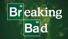
As the whole world knows, the show's title sequence works Scrabble-like periodic table tiles in sans type into serif words (possibly Ariel + Bundy). The Sun complicates matters further by incorporating the logo into its own splash headline face. And there's a two-line serif caps strap for good measure.
It might not have looked so bad if they'd gone for the logo from the earlier series (below), which used Cooper instead of Bundy.
But with the panel of text and drop-in pictures, it's just too much.


 RSS Feed


