Have we become blasé after the Olympics and the Tour de France? Or have we already written off Scotland as a foreign country?
The opening of the Commonwealth Games didn't get much of a look in on the English front pages. The Peaches Geldof inquest obviously dominated the tabloids, but for the rest, maybe the problem wasn't so much a lack of interest in the Games, as that the pictures from Glasgow just weren't that good.
The Mail had a picture of the Queen that could have been taken anywhere, the Guardian offered the ultimate product placement to Tunnock's teacakes and the Telegraph and i offered an inflatable Loch Ness Monster.
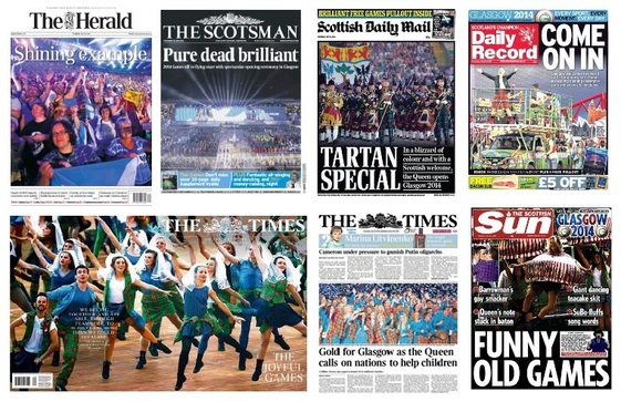
The Scottish editions were clearly obliged to make a fuss of the event, but they're all a bit of a mess, with the exception of The Times, which came up with its usual wraparound plus a "proper" front that was far more appealing than the national edition with its weeping Dutch Queen.
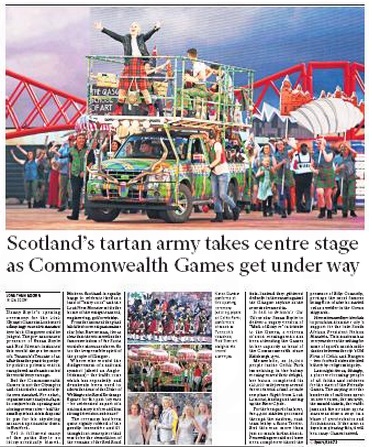
The Scotsman and the Herald both tried the poster front formula, but they both just missed: the Herald's heading gets lost and the Scotsman's elegance is betrayed by that uncomfortable colloquialism.
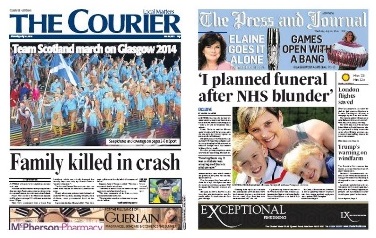
Nor did the Scottish regionals seem particularly enthralled. The Courier was more interested in a Falkirk family of four dying in a car crash and the Aberdeen Press and Journal confined its front-page coverage to a puff. It did, however, follow up with five rather good pages inside.
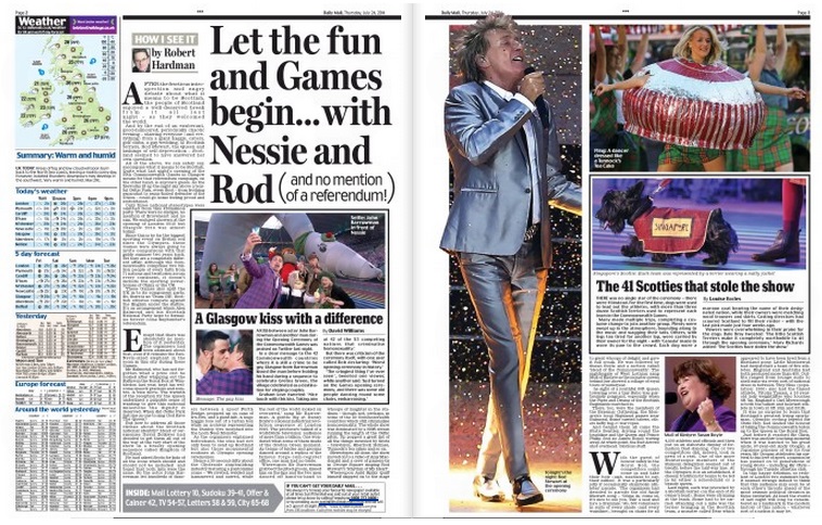
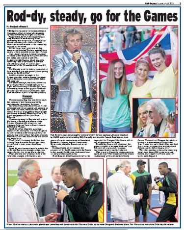
Down south, the Mail gave the Games the most prominence, with a 2-3 spread and the Express put them on 3. But look at those photographs - Rod Stewart, a scottie dog, some girls with a flag and a clutch of royals. Hardly the opening ceremony spectacle described in copy.
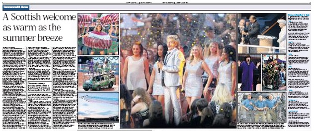
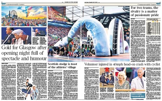
The Telegraph, below, fared a little better with its tidy composite, also on pages 2 and 3. But Rod could have been on any stage and the fact that he was surrounded by seven smaller pictures suggests none was good enough to stand alone.
The Telegraph, below, fared a little better with its tidy composite, also on pages 2 and 3. But Rod could have been on any stage and the fact that he was surrounded by seven smaller pictures suggests none was good enough to stand alone.
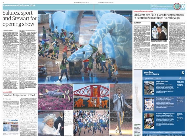
The Independent demonstrated the power of the single big picture on its page 5, and promptly squandered any interest it might have engendered with the dullest heading imaginable. The Guardian subs seemed equally unenthused with their lame alliteration. The Nessie picture that made the Telegraph and i fronts makes a good centrepiece for the spread - although it came as a shock to SubScribe, which had always imagined her to be green.
Nessie's face is less visible in the Times, but the full height compared with the shot chosen by the others makes her unmistakeable. Did we really need three royal pics on one spread - and isn't it treason to photograph Her Majesty adjusting her lipstick? (I would suggest it was more likely to be lipsalve - she'd have to be seriously bored to start doing her make-up in the middle of an occasion such as this.)
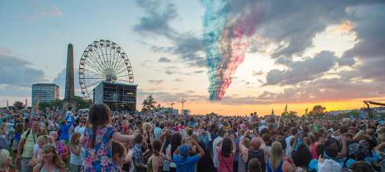
The Times has one of the most appealing pictures of the day in the top righthand corner of its spread, combining the Red Arrows, a golden sunset and colourful crowds in the "Live Zone".
The Times has one of the most appealing pictures of the day in the top righthand corner of its spread, combining the Red Arrows, a golden sunset and colourful crowds in the "Live Zone".
But is the photograph a little too colourful? Compare the image taken from the Times above with a similar shot, below, from the Mail website.
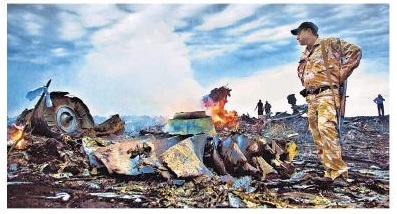
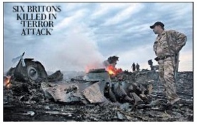
The Times version is certainly more vibrant, even if it does take liberties with nature. And does that matter if the result is a better picture and nobody has been moved or airbrushed out? On an occasion such as this, possibly not. But what about last week with the shooting down of Flight MH17. Compare the Times's front-page photograph last Friday with the same picture in the Telegraph:
This seems to be a bad habit to be getting into...and it certainly alarmed some photographers who commented on one online forum:

Can't quite get my head around why The Times has turned its front page colour into such a joke, the subtlety and mood has been totally ruined by appalling interpretation by someone on that picture desk. The future of news photography is definitely bright!!

Funnily enough I thought exactly the same thing when I saw them run through the front pages on BBC News last night, how did an awful HDR shot make it to the front page of the Times?

Awful, you would think they've passed it through an Instagram filter!

The whole presentation of a front page loses credibility with this chocolate box look. More suitable for a Valentines Day card than a national newspaper.

On the whole the fronts look pretty good, in fact the whole paper does. It's a shame James Harding didn't have the same care about pictures as John Witherow. Take the Times on July 16 of the cabinet ministers coming and going in to number ten. What a fantastic front that was

It totally distorts what was a good news image. Yes ok punch up the colours a tiny bit but when it's over cooked like this one and several others recently it looks dreadful. Someone needs to judge the integrity of the image and interpretation. Can you imagine taking a story and making the words more juicy - this is the same treatment. Liking photography is about appreciating what the photographer did and giving it the show it deserves, not trying to make it colorful by sliding the saturation control to the max.

Many like high saturated bright images; judges of photo competitions for one, go on about ICE, punch etc. and it's hard not to give them what they want!
SubScribe tends to agree with the photographers here about the plane crash picture, but rather likes the OTT Red Arrows picture, which stood out from a pretty lacklustre collection.
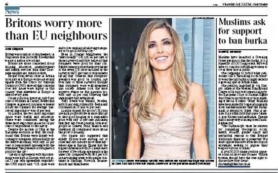
Any joy in that spread dissipated on turning the page, however. There we found that Cheryl Cole has not only changed her name, but has also dyed her hair. The use of such a pointless photograph for no reason other than to fill space with a pretty woman is a far greater sin than any over-drenching of pictures elsewhere. To give you the full flavour, the caption is reproduced in full.
Any joy in that spread dissipated on turning the page, however. There we found that Cheryl Cole has not only changed her name, but has also dyed her hair. The use of such a pointless photograph for no reason other than to fill space with a pretty woman is a far greater sin than any over-drenching of pictures elsewhere. To give you the full flavour, the caption is reproduced in full.


 RSS Feed

